skin.studio is a conceptual skincare brand developed as a personal branding project. The goal was to design a holistic visual identity that feels gender-neutral, science-based, and minimalistic, while still evoking a sense of luxury and avant-garde aesthetics.
From initial moodboard and positioning to typography, color system, packaging design, and social media strategy, I shaped every step of the brand creation process. The result is a cohesive identity system that combines functional clarity with emotional storytelling.

"A skincare brand where function meets feeling: science-based, minimalist, gender-neutral. Skin.studio creates effective products with a clean, avant-garde aesthetic — free from clichés, yet emotionally engaging."


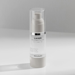
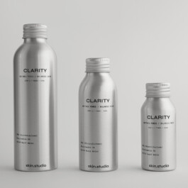
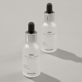
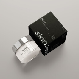
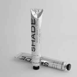
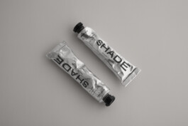
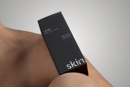
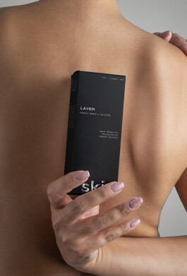
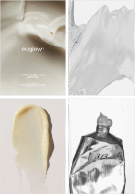
The skin.studio range consists of four core products, designed as a complete routine. Each product is visually consistent within the brand system, yet carries its own unique focus and atmosphere.
The packaging reflects skin.studio’s minimalist and science-driven identity. Deep graphite meets precise typography in Syne and IBM Plex Mono, while the silver foil logo adds a tactile, luxurious accent. A clean design system that communicates modern gender-neutral skincare.
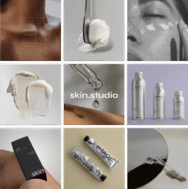
GRID STRUCTURE: A curated mix of Product Shots, Texture Details, Typography Posts, and Editorial Photography.
POSTING RHYTHM: Alternating functional product posts with emotional imagery ensures the feed stays dynamic, minimal, and visually balanced.


Excerpts from the skin.studio brand manual, documenting the identity system and its applications.
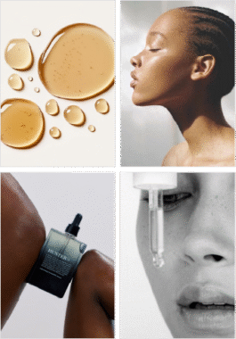
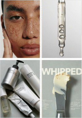
– natural light, high contrast, focus on textures (skin, liquids, creams)
– mix of clinical clarity (clean backgrounds, macro shots) and avant-garde mood (cropped faces, abstract compositions)
– muted palette in line with brand colors (Greige, Graphite, White, Lavender)
– subtle metallics (silver) as accents
– diverse models, real skin (pores, shine, freckles)
– product stills and textural studies